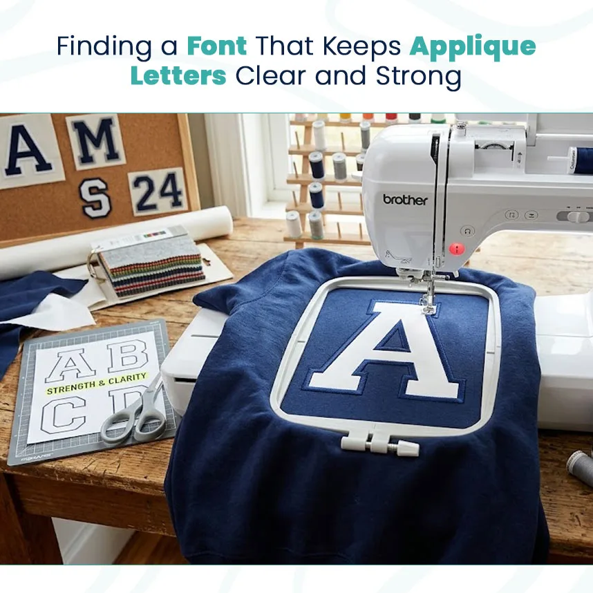
Good machine applique starts with a practical font choice. If the lettering is too delicate, crowded, or detailed, the fabric pieces can become difficult to cut and the stitching may not follow the design cleanly. Choosing the right style early can make the entire project easier.
Check Letter Structure First
Before thinking about decoration, examine the basic structure of each letter. Are the openings large enough? Are the strokes wide enough to hold applique fabric? Can the outer edge be covered neatly with stitching?
These questions matter because applique letters and fonts need to work as both artwork and embroidery.
A useful font should have:
Easy-to-read shapes
Balanced spacing
Strong outer edges
Enough room for fabric
Details that remain visible after stitching
Choose According to Letter Size
Font selection should always consider the finished size. Large applique lettering gives you more room for curved shapes, decorative elements, and fabric placement.
Small lettering requires more care. Narrow spaces can disappear, while thin strokes may not give enough room for a clean applique piece.
If the project uses small letters, simplify the design instead of trying to preserve every tiny detail from the original font.
Think About Fabric and Garment Use
A school jacket, cotton shirt, sports uniform, and decorative wall piece do not behave the same way. The fabric affects how the applique piece sits and how the border stitches appear.
For heavier garments, stronger and larger letter shapes can work well. Lightweight fabrics may need a simpler design with proper stabilization.
Make a Test Before the Full Run
A sample is important when the design will be produced in quantity. It gives you a chance to see whether the fabric shifts, whether the border covers the raw edge, and whether the lettering stays readable.
If something looks crowded, adjust the spacing or simplify the font before production.
The strongest font choice is the one that balances style with stitchability. When the letters are designed for the actual embroidery conditions, applique can look clean, consistent, and professional.
VISIT: https://note09663.tistory.com/2